ShopDreamUp AI ArtDreamUp
![Devil's Fire [speedpaint]](https://images-wixmp-ed30a86b8c4ca887773594c2.wixmp.com/f/b484c09c-402c-4d7e-a500-1c2f6ca2be0f/d9p78yr-1c72ede9-183c-483e-834c-08a80fb521f6.png?token=eyJ0eXAiOiJKV1QiLCJhbGciOiJIUzI1NiJ9.eyJzdWIiOiJ1cm46YXBwOjdlMGQxODg5ODIyNjQzNzNhNWYwZDQxNWVhMGQyNmUwIiwiaXNzIjoidXJuOmFwcDo3ZTBkMTg4OTgyMjY0MzczYTVmMGQ0MTVlYTBkMjZlMCIsIm9iaiI6W1t7InBhdGgiOiJcL2ZcL2I0ODRjMDljLTQwMmMtNGQ3ZS1hNTAwLTFjMmY2Y2EyYmUwZlwvZDlwNzh5ci0xYzcyZWRlOS0xODNjLTQ4M2UtODM0Yy0wOGE4MGZiNTIxZjYucG5nIn1dXSwiYXVkIjpbInVybjpzZXJ2aWNlOmZpbGUuZG93bmxvYWQiXX0.r4Exiqdx7x8GLEv6Tz6dvPapaUf_wbmXWUT4tO0JJ74)
Deviation Actions

![[FA] Rainu Bust](https://images-wixmp-ed30a86b8c4ca887773594c2.wixmp.com/f/b484c09c-402c-4d7e-a500-1c2f6ca2be0f/d9k27ct-1278affd-c790-4323-bdad-3d982c934d28.png/v1/crop/w_92,h_92,x_0,y_0,scl_0.184/_fa__rainu_bust_by_jennshiki_d9k27ct-92s.png?token=eyJ0eXAiOiJKV1QiLCJhbGciOiJIUzI1NiJ9.eyJzdWIiOiJ1cm46YXBwOjdlMGQxODg5ODIyNjQzNzNhNWYwZDQxNWVhMGQyNmUwIiwiaXNzIjoidXJuOmFwcDo3ZTBkMTg4OTgyMjY0MzczYTVmMGQ0MTVlYTBkMjZlMCIsIm9iaiI6W1t7ImhlaWdodCI6Ijw9NTAwIiwicGF0aCI6IlwvZlwvYjQ4NGMwOWMtNDAyYy00ZDdlLWE1MDAtMWMyZjZjYTJiZTBmXC9kOWsyN2N0LTEyNzhhZmZkLWM3OTAtNDMyMy1iZGFkLTNkOTgyYzkzNGQyOC5wbmciLCJ3aWR0aCI6Ijw9NTAwIn1dXSwiYXVkIjpbInVybjpzZXJ2aWNlOmltYWdlLm9wZXJhdGlvbnMiXX0.owrw5aZwGRxkkwE4oToK--3nlB3KCG2m9GLKqyctZGo)


![[open] flowers x plaids OTA](https://images-wixmp-ed30a86b8c4ca887773594c2.wixmp.com/f/b484c09c-402c-4d7e-a500-1c2f6ca2be0f/d9tqt47-c2340bba-c55c-4e26-88c4-cec468cb10be.png/v1/crop/w_92,h_92,x_0,y_14,scl_0.24274406332454,q_70,strp/_open__flowers_x_plaids_ota_by_jennshiki_d9tqt47-92s.jpg?token=eyJ0eXAiOiJKV1QiLCJhbGciOiJIUzI1NiJ9.eyJzdWIiOiJ1cm46YXBwOjdlMGQxODg5ODIyNjQzNzNhNWYwZDQxNWVhMGQyNmUwIiwiaXNzIjoidXJuOmFwcDo3ZTBkMTg4OTgyMjY0MzczYTVmMGQ0MTVlYTBkMjZlMCIsIm9iaiI6W1t7ImhlaWdodCI6Ijw9NjE0IiwicGF0aCI6IlwvZlwvYjQ4NGMwOWMtNDAyYy00ZDdlLWE1MDAtMWMyZjZjYTJiZTBmXC9kOXRxdDQ3LWMyMzQwYmJhLWM1NWMtNGUyNi04OGM0LWNlYzQ2OGNiMTBiZS5wbmciLCJ3aWR0aCI6Ijw9Mzc5In1dXSwiYXVkIjpbInVybjpzZXJ2aWNlOmltYWdlLm9wZXJhdGlvbnMiXX0.AZlGqjW74xLYF1P3-sE0wuMc-KB-a9q_q-mAK5SfuOI)


Suggested Deviants


Suggested Collections


![[FanArt] World is mine - Hatsune Miku](https://images-wixmp-ed30a86b8c4ca887773594c2.wixmp.com/f/89b7edfc-64d7-477d-96a7-a62f11b4f44e/ddz4lw3-961f62fd-d6a2-484c-9697-19c22894b3c0.png/v1/crop/w_184,h_184,x_35,y_0,scl_0.15333333333333,q_70,strp/_fanart__world_is_mine___hatsune_miku_by_celesteis_ddz4lw3-92s-2x.jpg?token=eyJ0eXAiOiJKV1QiLCJhbGciOiJIUzI1NiJ9.eyJzdWIiOiJ1cm46YXBwOjdlMGQxODg5ODIyNjQzNzNhNWYwZDQxNWVhMGQyNmUwIiwiaXNzIjoidXJuOmFwcDo3ZTBkMTg4OTgyMjY0MzczYTVmMGQ0MTVlYTBkMjZlMCIsIm9iaiI6W1t7ImhlaWdodCI6Ijw9MTIwMCIsInBhdGgiOiJcL2ZcLzg5YjdlZGZjLTY0ZDctNDc3ZC05NmE3LWE2MmYxMWI0ZjQ0ZVwvZGR6NGx3My05NjFmNjJmZC1kNmEyLTQ4NGMtOTY5Ny0xOWMyMjg5NGIzYzAucG5nIiwid2lkdGgiOiI8PTIxMDAifV1dLCJhdWQiOlsidXJuOnNlcnZpY2U6aW1hZ2Uub3BlcmF0aW9ucyJdfQ.7ie5cAiBP6x2cniqPfd9GUIWXV_pQmohLPSl3x8xlsE)
![[FanArt] World is mine - Hatsune Miku](https://images-wixmp-ed30a86b8c4ca887773594c2.wixmp.com/f/89b7edfc-64d7-477d-96a7-a62f11b4f44e/ddz4lw3-961f62fd-d6a2-484c-9697-19c22894b3c0.png/v1/crop/w_92,h_92,x_17,y_0,scl_0.076666666666667,q_70,strp/_fanart__world_is_mine___hatsune_miku_by_celesteis_ddz4lw3-92s.jpg?token=eyJ0eXAiOiJKV1QiLCJhbGciOiJIUzI1NiJ9.eyJzdWIiOiJ1cm46YXBwOjdlMGQxODg5ODIyNjQzNzNhNWYwZDQxNWVhMGQyNmUwIiwiaXNzIjoidXJuOmFwcDo3ZTBkMTg4OTgyMjY0MzczYTVmMGQ0MTVlYTBkMjZlMCIsIm9iaiI6W1t7ImhlaWdodCI6Ijw9MTIwMCIsInBhdGgiOiJcL2ZcLzg5YjdlZGZjLTY0ZDctNDc3ZC05NmE3LWE2MmYxMWI0ZjQ0ZVwvZGR6NGx3My05NjFmNjJmZC1kNmEyLTQ4NGMtOTY5Ny0xOWMyMjg5NGIzYzAucG5nIiwid2lkdGgiOiI8PTIxMDAifV1dLCJhdWQiOlsidXJuOnNlcnZpY2U6aW1hZ2Uub3BlcmF0aW9ucyJdfQ.7ie5cAiBP6x2cniqPfd9GUIWXV_pQmohLPSl3x8xlsE)


You Might Like…


![[Collab] Winter Glance](https://images-wixmp-ed30a86b8c4ca887773594c2.wixmp.com/f/fd2259ce-e153-4028-b0a3-21785c1f1c7b/dbdlgi9-1a8977e4-f9bd-4385-b6e6-7850575417bc.png/v1/crop/w_184,h_184,x_0,y_15,scl_0.19388830347734,q_70,strp/_collab__winter_glance_by_rustyx3x_dbdlgi9-92s-2x.jpg?token=eyJ0eXAiOiJKV1QiLCJhbGciOiJIUzI1NiJ9.eyJzdWIiOiJ1cm46YXBwOjdlMGQxODg5ODIyNjQzNzNhNWYwZDQxNWVhMGQyNmUwIiwiaXNzIjoidXJuOmFwcDo3ZTBkMTg4OTgyMjY0MzczYTVmMGQ0MTVlYTBkMjZlMCIsIm9iaiI6W1t7ImhlaWdodCI6Ijw9MTI1OCIsInBhdGgiOiJcL2ZcL2ZkMjI1OWNlLWUxNTMtNDAyOC1iMGEzLTIxNzg1YzFmMWM3YlwvZGJkbGdpOS0xYTg5NzdlNC1mOWJkLTQzODUtYjZlNi03ODUwNTc1NDE3YmMucG5nIiwid2lkdGgiOiI8PTk0OSJ9XV0sImF1ZCI6WyJ1cm46c2VydmljZTppbWFnZS5vcGVyYXRpb25zIl19.-PruaaSP8OiQ-nfBTzn4xrwYuuG0SN5kzUlO6-IgStY)
![[Collab] Winter Glance](https://images-wixmp-ed30a86b8c4ca887773594c2.wixmp.com/f/fd2259ce-e153-4028-b0a3-21785c1f1c7b/dbdlgi9-1a8977e4-f9bd-4385-b6e6-7850575417bc.png/v1/crop/w_92,h_92,x_0,y_7,scl_0.096944151738672,q_70,strp/_collab__winter_glance_by_rustyx3x_dbdlgi9-92s.jpg?token=eyJ0eXAiOiJKV1QiLCJhbGciOiJIUzI1NiJ9.eyJzdWIiOiJ1cm46YXBwOjdlMGQxODg5ODIyNjQzNzNhNWYwZDQxNWVhMGQyNmUwIiwiaXNzIjoidXJuOmFwcDo3ZTBkMTg4OTgyMjY0MzczYTVmMGQ0MTVlYTBkMjZlMCIsIm9iaiI6W1t7ImhlaWdodCI6Ijw9MTI1OCIsInBhdGgiOiJcL2ZcL2ZkMjI1OWNlLWUxNTMtNDAyOC1iMGEzLTIxNzg1YzFmMWM3YlwvZGJkbGdpOS0xYTg5NzdlNC1mOWJkLTQzODUtYjZlNi03ODUwNTc1NDE3YmMucG5nIiwid2lkdGgiOiI8PTk0OSJ9XV0sImF1ZCI6WyJ1cm46c2VydmljZTppbWFnZS5vcGVyYXRpb25zIl19.-PruaaSP8OiQ-nfBTzn4xrwYuuG0SN5kzUlO6-IgStY)


Featured in Groups


Description
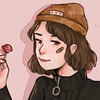
drawing of this cute character I got from XmasCandy ! Her name is Daisy
art + character : me
i do like how the clouds look haha
I really don't like my style I need to find a new one *n*
speedpaint: www.youtube.com/watch?v=dAEdgc…
art + character : me
i do like how the clouds look haha
I really don't like my style I need to find a new one *n*
speedpaint: www.youtube.com/watch?v=dAEdgc…
Image size
382x453px 222.27 KB
Comments3
Join the community to add your comment. Already a deviant? Log In
I definitely relate to what you mean when you say you want another style lol, I'm currently trying to mold mine into something else to better fit my vision of what I want to draw like.
So first of all I really love the color palate you chose, it's very lovely has gives you this girly, childish, magical feel which is perfect.
One thing though I think that would help is adding more folds to your clothes, I see you're already doing a little bit of this but I think doing more would greatly help the overall look. A good way to practice this is to just draw clothes in real life, just throw clothes on the floor, and draw them. Be sure to take note of all the folds and wrinkles in the cloth, it's really cool because depending of the fabric it'll look different and stuff. Of course once you're done be sure to clean up the clothes so your guardians don't yell at you XD. I really like what you're already doing with the folds in your clothes, more is better, keep up the fabulous work.
So I'm guessing that the dress is supposed to baggy since the sleeves (very nicely done btw) are pretty baggy. But the torso of the dress makes her look disproportionate because of her lil neck and legs and then BOOM, large torso. You can just fix this by drawing more wrinkles (like I mentioned earlier). Also the neckline would probably be lower because of the bagginess. The dress itself is very cute though and I really love the design.
So while I really love so much about her face, those beautiful eyes, her mouth shape, THOSE FRECKLES, HER NOSE and of course the colors, I do see something that could use improvement. Her expression is a tad bland which I really hate to see since I love her features so much. I recommend looking around you at how people's faces change depending on their emotions, look up some photo references and take notice of little things. For example (usually) When people feel positive emotions like happiness and excitement their faces tend to stretch out and get longer, and the opposite is usually true as well. When people feel sad or angry their faces tend to scrunch up and get all wrinkly. The expression overall isn't actually that bad, it just could use more motion and life to it. Good job!
So I think that this may be the only facial feature that could use work, her eyebrows don't quite look right on her face. I like the shape and color but the positioning is off, they should be more in. Now I'm no eyebrow expert but there's a law on the placement of these bushes. This guy explains it better than I ever could lol:
www.youtube.com/watch?v=Qqi0o1…
So basically the edge of your nostrils will line up with the beginning of your brows. I hope that video helps. A lil bitty fix that goes a long way.
So while the colors in the piece are quite lovely and you have the right idea with your shading technique, there aren't any highlights and that's giving the piece this muddy look. So much like how you put darker colors in the areas that would have shadow, it's very important to put lighter shades in the areas where the light is hitting. Doing this will make your piece look shinier and not so muddy. It's kinda like what you do to your eyes in the drawing (Which are beautiful btw).
So it appears that you've got anatomy pretty down itself which is amazing, like that hand gurl, mmmmm. So good. But my one criticism about the body as a whole is a very common problem I see with a lot of artists I give critiques to. The pose itself looks very stiff which can really damper the piece as a whole. What I recommend to fix this is to first to draw the line of motion before drawing the pose. I also recommend not spending too much time on the sketch which is super difficult because PERFECTION, but it really helps make the sketch looser. I also recommend using lighter lines for the sketch so it doesn't become stiff. Then also this is a weird one feeling-wise but try and draw with your elbow or shoulder instead of your wrist or worse, hands. Basically what I mean by this is to move your shoulder/elbow to draw your sketch. Here's another guy better at explaining than me lol:
www.youtube.com/watch?v=9KaTaW…
I also recommend always using a quality reference for drawing, especially poses. What I like to do is run down to the good ole Google images and search for the pose I have in mind. You can also have a friend pose for you or pose yourself as a reference. Whatever works.
So while I do quite like the layers of shading technique you have going on there, it needs direction and some organization. What I'm talkin about is that you should choose a light source. basically you pick a point on or off the page and pretend that's the sun (or a lightbulb or whatever) and anywhere the light would actually touch is where the highlights would be and anywhere it's not the shadows should be. So all your shadows should be on the same side of your drawing (mostly) and all of the highlights should be on the same side of the object (again mostly). So I also see that you have some blue fire going on there in the piece, that means you have yourself a second light source, and a colored one at that! So what this means is the areas close to and facing this fire should have some blue light on them like on the palm of her hand and a little bit of her arm, chest and face. I can kinda see you've kinda got a starting grasp of this but it would really plant that fire into the picture better by doing this.
So another tip I have which is purely stylistic is to try and color with non black lines. I can see you're starting to do a little bit of this like on the side of her dress and her legs but I think that it would look better with even more. I've noticed that thick black lines can often make a piece look a bit harsh and kinda heavy which can be okay in some cases but I'm thinking with this little girl some colored lines would look better.
I completely get it when you say that you're unsatisfied with your style. It can be quite frustrating to not draw the way you want but hang in there and practice practice practice! What I recommend doing is making a list of things you don't like about your style, things you want more o in your style, and things you like about other people's styles that you want to incorporate into your style. Then of course take time to work on each of these things. Fill up entire pages with your practice work, draw pieces around these aspects you'd like to incorporate into your style. I've found that a style is developed by equal amounts of doing what you're comfortable with and trying new things. Remember, it's very important that even if you're not drawing to the standard that you strive for, to love what you create and never give up!